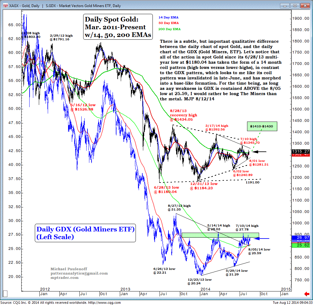
A Comparative-Chart View of Gold vs. The Gold Miners
There is a subtle, but important qualitative difference between the daily chart of spot Gold, and the daily chart of the (GDX).
Let's notice that all of the action in spot Gold since its June 28, 2013, multi-year low at $1180.04 has taken the form of a 14-month coil pattern (high-lows versus lower-highs), in contrast to the GDX pattern, which looks to me like it's coil pattern was invalidated in late June, and has morphed into a base-like formation.
For the time being, as long as any weakness in GDX is contained above the August 5 low at 25.59, I would rather be long the miners than the metal.