My Gold vs. 10-Year YIELD Comparison Chart Whispers REFLATE, REFLATE, REFLATE to Investors
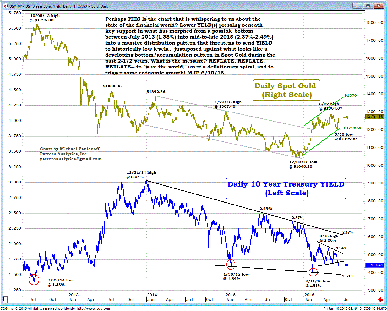
Perhaps this is the chart that is whispering to us about the state of the financial world?
Lower YIELD(s) pressing beneath key support in what has morphed from a possible bottom between July 2013 (1.38%) into mid-to-late 2015 (2.37%-2.49%) into a massive distribution pattern that threatens to send YIELD to historically low levels... juxtaposed against what looks like a developing bottom/accumulation pattern in Spot Gold during the past 2-1/2 years.
What is the message?
REFLATE, REFLATE, REFLATE-- to "save the world," avert a deflationary spiral, and to trigger some economic growth!